Thursday, October 23, 2008

food galore

one night we were chatting it up, Mia asked if I wanted to do lunch with her en route to our Saturday scrapping engagement, at the Pink Kitchen event in Rockwell. It's a foodie event put together by the ICanServe foundation in support of women with breast cancer, hence the P200 entrance fee.


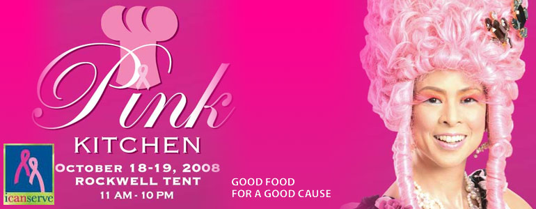
Despite the long wait - we have had to queue for food stubs (they ran out!) as you couldn't do cash transactions - I'm glad I went. The place was still packed at 2 PM but everything looked delectable. LOL! Unfortunately, I wasn't able to take that many photos as I forgot to recharge my batteries! :(

I loved their table centerpieces. Here's a not so decent photo. Yes, I was much too embarrassed to take photos when strangers were sitting on the opposite side of the table. LOL!


After going around the tent for what must've been 3x, Mia and I finally settled on an open-face pastrami sandwich from Chelsea and fresh mushroom canneloni (yum-o) from La Tasca. I am salivating just thinking about it. I would've gone on Sunday too but I couldn't. Had to take care of some business on the home front.


After our late lunch, we headed over to the popsicle booth to get us some treats :) all the flavors sounded inviting, but i decided on a watermelon pop. it tasted a bit off (like a watermelon gone off, if you kwim) + it was kinda bland for my taste but i enjoyed it just the same. a pop is still a pop. haha.

Mia wanted to drop by the cuppycake booth to get some sweets for the girls.


while I got a box of mochi. hmm. i thought they'd be like the ones I had in Singapore (frozen ice cream balls) but these turned out to be Japanese rice cakes coated/filled with dark chocolate, milk chocolate, walnuts and green tea. they tasted good though.


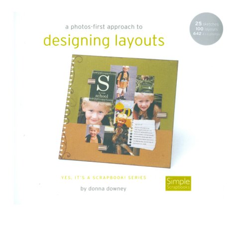
We stopped by Vivian's store (got a few things) and then we eventually headed over to Mitch's, and of course, I had to get some more things from there, too *wink!* I especially love the book on Designing Layouts by Donna Downey. Can't wait to put it to good use!


We ordered dinner in, so we had a table full of Chinese yumminess (I wasn't able to take a decent photo). Then it was time for dessert. Because we wanted to taste more than 1, Mia and I each shared the
"MARIE ANTOINETTE" - Vanilla Cupcakes with Tequila Rose Buttercream (virgin version!!)
"SUGAR DADDY" - Moist chocolate cupcakes with Bailey's Buttercream

Both tasted good! Next time, I would have to remember to try the
"CHANEL" - Moist Chocolate Cupcake with Valrhona Buttercream
"TRES CHIC" - Vanilla Cupcakes with Valrhona Buttercream
"SATINE" - Red Velvet Cupcakes with Cream Cheese Frosting

I didn't get to work on anything - I pretty much just enjoyed the food, and of course, the company =)

Wednesday, October 22, 2008

2nd chance

i couldn't believe my lucky stars! here i thought it was the end of the line for me at the Top Designer class/challenge over at BG. Then I got a PM from Tracie telling me this:

You have been selected as the Wild Card Player for Class 6.


I was given a username : **WiLdCaRdEiGhT** so I could play along anonymously. How fun was that!? :D

All I had to do was follow a set of rules, all in the name of anonymity, and of course, to create a LO (no family/identifying photos allowed) for Class 6 for me to be back in the running.

Challenge was to break a few scrapbooking rules here and there with the end in view of making our pages eventually come together by putting in our personal flair.

A final note from Tracie:
Please note that there are no guarantees that you will make it through to the final assignment.....but I will be keeping my fingers crossed for you as I love your style.


I tried to come up with a LO at the last minute as I found it tough just to find photos that couldn't be associated with me. I worked on my page on Sunday morning. 1st attempt looked kinda messy coz of my paint job, but I managed to salvage my orange lace cardstock, paint stains and all, and use it on a fresh sheet of cardstock. This time around, I was hesitant to stamp with paint for fear of messing up yet another paper, but i wanted the page to look grunged up a bit, so I did it anyway. I like the results, even if i do say so myself. lol.

Here's a few rules I broke, I think:
BALANCE: right-heavy page. photos, embellishments and papers were all placed on the right side

COLORS: page colors not coordinated with those in the photos.

VISUAL TRIANGLE: none used

UNITY: photo sizes used were not the same

GALLON QUART PINT: none followed

How I added my style
1. used a short title
2. clustered photos
3. clustered embellishments
4. strip journaling
5. simple embellishments/minimal hand-cutting
6. didn't fill every space on the page :)


i didn't make it to the final round, but I'm glad to have made it this far in the contest, and more importantly, to have been given another opportunity to play again :)

Good luck to the Top 10 (11) girls who are in it for the final round. You are all very talented, can't wait to see who comes out to be the 2nd Top Designer! :D

Sunday, October 19, 2008

being neighbourly


just a quick thank you card for one very hospitable neighbour :)

Monday, October 13, 2008

it ends tonight

i excitedly conceptualized and created my page for this week's class/challenge COLOR PSYCHOLOGY.

Not long after I posted it into the gallery, I found out from a couple of Bad Girls that I wasn't supposed to use a B&W photo. I didn't believe it at first, as there was nothing specific indicated when the class was posted, but apparently, buried somewhere among the member posts, was a follow up instruction that we were only to use colored photos! ACK!! It was too late. I had no other immediate ideas to work with, so I left my LO alone. My only consolation is that I am happy with the way this page turned out - it's almost just as I envisioned it when I was still sketching it out a few days ago.


The honor roll list was posted a few hours ago and just as I predicted, my name was no longer in it :( at least, there's always next year to look forward to. I'm glad I made it to the 5th round this year, 1 round more than how I fared last year =)


Friday, October 10, 2008

design your life


so happy to have this opportunity to sign up for an online class with Cathy Zielske! YAY!!!

sign up - check!
scrap supplies - check!
pre-work - need to get moving!
assignment 1 - i'd better catch up real quick! assignment 2 is going to be up soon! ;)

Thursday, October 9, 2008

moving on

to round 5!! how friggin' awesome is that? never in my wildest dreams did i imagine i'd be moving past class 4 especially because even after 6 days of mulling over the class' design principles (accessorizing + unity, harmony, balance and texture concepts to boot!), i still had no idea what to work on and add to to that the fact that i only managed to find/print out photos well under 2 hours before the submission deadline! talk about pressure! :o whew!

To put these principles into better perspective, Bethany shared these concepts:

UNITY is defined as the visual linking of the elements in the piece. Accessories can unify by providing flow from various areas in a layout.

I tried to achieve it by linking my photos together to show the flow of the action shots better. i also tried to help the movement flow by placing arrows here and there and then i added a small piece of map paper to further reinforce the theme of my LO.

HARMONY is the visually pleasing effect of combining similar elements. This can be achieved through various mediums including color and shape.

For this I used similar photo sizes and colors found in the photos

BALANCE is pleasing proportion. i decided to go for the symmetrical principle.

TEXTURE is the tactile surface of a work of art. In layman’s terms, it is the feel of various elements. It is the smooth wood, or the bumpy lace, the ripple in the ribbon, etc. Some of the easiest ways to add texture are via distressing and sewing.

So I layered, distressed (crumpled, torn, painted, inked) papers, used grunge board, lots of staple wire, distressed chipboard, punchinella, tape label, and metal embellishment.

Treasure Hunters


still can't figure out how i got through this one! haha! but i am glad, of course! ;)

actually, i was even more surprised that i moved on from class 3 (less is more principle) last week - I can still remember how i was booted out of the white space class last year! haha!

What Matters Most


i'm happy about how this one turned out! ;) thanks to the principles shared by Sri Sams.

Achieving BALANCE is the most important principle in creating a simple layout. Balance refers to the weight of a design based on the elements and objects of the design. Balance can either be symmetrical or asymmetrical.

I decided to go for the asymmetrical balance by putting more weight on the right side, where the photos are

To achieve balance, you have to take control of space. White space is always an active element in a good design. White space is also known as negative space. It doesn't mean it has to be white because it can be any color whether it is black, brown or white. It’s also up to the designer to make it an important element of design because if not used properly it can be misunderstood for wasted space. When used properly, it allows a breathing space and provides the simplest way to unite elements of the layout.

I decided to leave out some space above and below the photos then I grouped the embellishments to the left of the photos

Unity is achieved when elements in a given space have a direct, cohesive relationship to one another. Unify elements by grouping elements that are close together so that they look like they belong together:
- Lining up or grouping photos together.
- Use the same color palette throughout.
- Repeat a color, shape or texture in different areas throughout.
- Choose elements that share a similar color, theme or shape.

So for unity
- I used similar photos
- I lined up photos together
- I also repeated/used the same color palette (papers and embellishment colors taken from the colored photo)
- I likewise repeated several round embellishments (flower, brad, clock)

TFL!

Wednesday, October 8, 2008

Scrap Party

I actually had no plans of going (oops!) but our gracious boss lady, Tin invited us as Studio Azul was putting up a booth - I couldn't very well say no to that! :) HEHE!

Of course, it was a fun opportunity to spend time with the rest of the Studio Azul team and to witness the 2nd Scrappinmoms' Idol contest. Congrats to Cookie, Issa and Donna, as well as to the rest of this year's top 10 contenders! You did well, girls!

I consider this to be the 1st official photo op for the SA blue ladies - so proud to be a part of this team! Notice our spanking new denim aprons, courtesy of the ultimate blue lady herself, Tin :) Thanks, Tin! I love it!


Here are some shots from the Scrap Party
AM


PM


Won myself a hot pink scrap apron


here's the loot! YAY for shopping self-control! HEHEHE!!


Thanks, Alby for this wonderful card and for considering me to be your card-maker inspiration :) - i don't believe I have the K to be considered one, but thanks anyway. i'm really flattered! ;)

After watching the Idol contenders battle it out for 3 hours, the SA Team decided to get together for a bite before heading on home. Mia suggested we head over to Arya, a Persian restaurant, at the Greenhills Promenade. Yum! Food was really good!


Pita bread with a variety of dips - hummus, eggplant with tomatoes, another eggplant dip (i forget the name), and cucumber with yogurt. mmmm-mm.


Went for a Chicken Koobideh - portion was kinda big for me so I had to get a doggy bag, haha!


Nita, Au and Cabbie


Mia, Tin and moi - sans sleep as I had to rush 2 mini albums =)


Had a great time catching up with you girls!

when do we go back for another yummy treat? :)

Monday, October 6, 2008

DDD #27

had to think of a quick LO for this challenge as I had the bright idea of working on this just before I did Sri's class assignment. Can't blame a girl for picking out less stressful challenges to tackle, haha!

perfect timing for this challenge too, as SA girls recently got together for a fun crop - so I had some photos to scrap! =) actually, i originally intended to use this homemade background paper (bazzill + HS mask + glimmer mist) for class 3 but I didn't think the glimmer mist color i used matched some of my beach photos. oh well. am just glad i was able to recycle the paper for this challenge LO


TFL!